


Ontario Volleyball Branding


Objective
K Design Studio was selected by Ontario Volleyball Association (OVA) to design their new corporate branding.
Creative Director, Kristine Verbeek, and owner of K Design Studio has been designing for Ontario Volleyball since she won their OVA Championships Logo Competition in 2008. Since then Kristine has designed for the OVA:
Other Ontario Volleyball Designs by K Design Studio
OVA hired K Design Studio to create a new corporate logo similar to the Team Ontario logo Kristine designed for them in 2009. They were looking for a FRESH, new, more modern, and clean look to better represent the organization and its athletes, coaches, officials, and stakeholders. They also required a logo that was easier for embroidery and legible at small sizes.
Solution
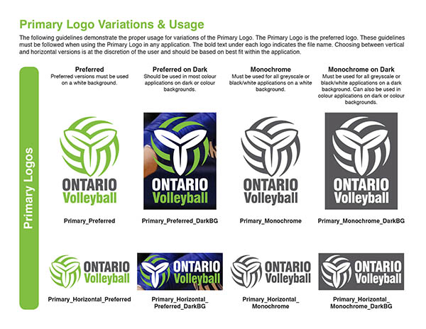
K Design worked closely with Jason Jackson from OVA to create many concepts and variations. Our aim being to refresh and modernize the Association’s brand, while still recognizing and appreciating its rich history. Keeping with tradition from the previous logo, the trillium – the official flower of Ontario – remained the focal point and was simplified further from the Team Ontario logo, and seamlessly incorporated into a more minimalist, yet stylish volleyball shape. The logo was designed with style, precision, symmetry and flow in mind – all qualities that stand out in the sport of volleyball. While green has long been the primary colour of the OVA brand, the new brighter green hue (originally pitched by K Design 9 years previous) offers a more fun, sporty, modern feel. After much experimentation, a strong, yet legible typeface was also selected that boldly proclaims the province in all caps and highlights the sport with the same contemporary green colour.
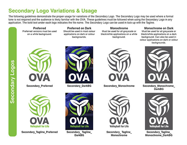
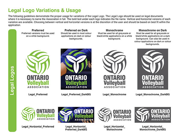
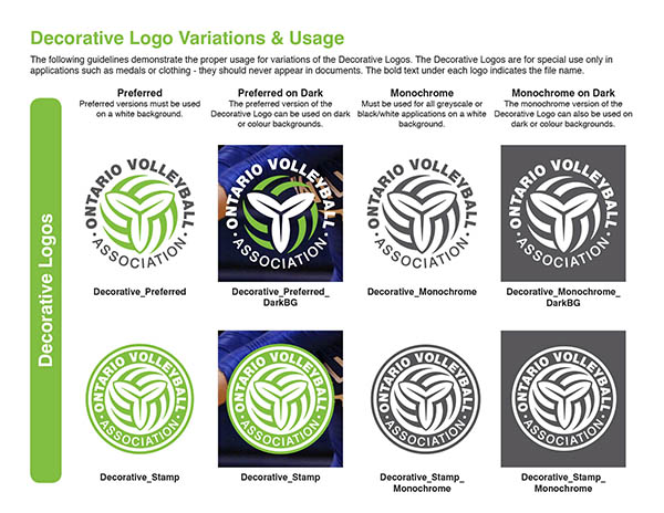
A secondary set of logos, featuring the “OVA” acronym that has become so well recognized throughout the sport, was created along with a similar version incorporating the tagline “Volleyball for Life”, the Association’s official tagline. We also suggested and were approved to create a circular, decorative version of the logo which would predominantly be used and benefit the merchandise sector of development for caps, t-shirts, metals etc. After all was confirmed, we worked to create multiple, matching series of logos on different coloured backgrounds, as well as vertical and horizontal formats, to ensure there were available options for all backgrounds and spaces.
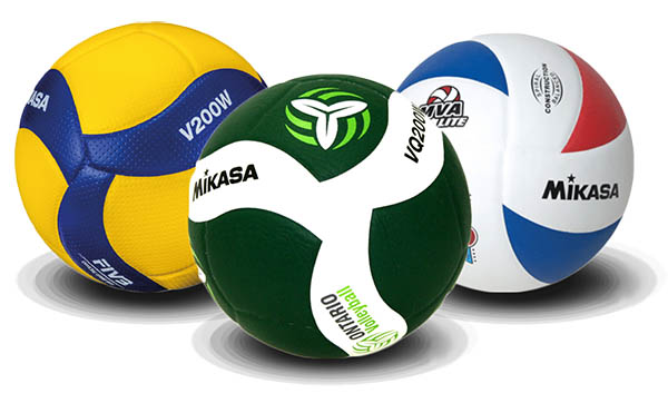
Our final selections were presented to Overkill at Canuck Stuff, the OVA official Merchandiser/Retailer, to ensure the designs would work for their merchandise as well. We tweaked further until all parties were satisfied, and excited about the final selections.
The Launch
The new OVA branding was announced and released into the massive sporting world on Sept 18, 2017.
K Design is truly honoured to be Graphic Designer for Ontario Volleyball and be part of this dream project. Creative Director, Kristine Verbeek, is a long-time volleyball athlete, coach and volleyball supporter.
Contact OVA for the complete Brand Guidelines.
Client Comments
Jason Jackson, Marketing Manager, Ontario Volleyball Association
The OVA would like to thank Kristine Verbeek of K Design Studio, Fred Koops of Overkill/CanuckStuff and Jessica Braun for their roles in developing the new brand and creating the logos. Their tremendous design talents and thorough understanding and appreciation for volleyball in Ontario have helped to shape the OVA brand for years to come.
More OVA & Sport Designs
If you are interested in more sport designs by K Design Studio, click HERE!