


Express Yourself
Colour Trends 2013
According to the colour experts at the Pantone Color Institute, fashion designers are overwhelmingly addressing the consumers’ desire for self-expression, balance and the need to re-energize in their spring 2013 fashion collections.

“The colour direction for spring builds upon these compelling needs with a palette that mixes dynamic brights with novel neutrals to create a harmonious balance,” according to Pantone’s colour report. “The expression ‘balancing act’ is something we all relate to as we strive to find harmony in the frantic pace of our everyday lives,” said Leatrice Eiseman, executive director of the Pantone Color Institute. “The same can be said for fashion as we look for balance between light and bright, classic and new. This season’s colour palette emphasizes this need for balance, while at the same time allowing for individuality, self-expression and excitement.”
The prevalence of green this spring is undeniable. Similar to the many shades in our natural surroundings, this season’s greens offer a stunning foreground or the perfect backdrop for all other hues. Like the first signs of spring, ‘Tender Shoots’, a vibrant yellow-green, is invigorating, active and cheerful, while ‘Grayed Jade’, a subtle, hushed green with a gray undertone, brings about a mood of quiet reflection and repose. Sophisticated ‘Emerald’, a lively, radiant green, inspires insight and clarity while enhancing our sense of well-being. From one extreme to the other, combining all three greens presents an intriguing choice much like Mother Nature intended.
Exotic ‘African Violet’ is a statement colour that brings a touch of intrigue to the palette, as purples often do, and can be incorporated into many unexpected combinations. Try pairing it with exuberant ‘Poppy Red’, a seductive, sensual and celebratory shade. Whether it’s a knockout dress or a kiss on the lips, every woman’s wardrobe and beauty essentials should include this spirited, true red.
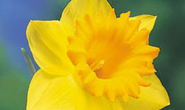
‘Nectarine’, a bright, effervescent citrus orange with coral undertones, provides a tangy burst of flavour while cheerful ‘Lemon Zest’ brings out a piquant taste with its refreshing, spritely greenish cast.
Signifying the time of day when everything starts to wind down, ‘Dusk Blue’ offers a calming sense of serenity akin to its green counterpart, ‘Grayed Jade’. Both of these colours act as the season’s newest neutrals. For an unexpected mix, pair Dusk Blue with the intensity of Nectarine.
A warm neutral, Linen is light and airy, providing a nude like basic that is a must have for spring. Try pairing Linen with Grayed Jade or Dusk Blue. Anchoring ‘Monaco Blue’ is a classic shade that offers both stability and depth to the entire palette. Combine ‘Monaco Blue’ with ‘Poppy Red’ and ‘Linen’, or ‘Monaco Blue’ and ‘Emerald’ for a fresh collegiate look.
For over 20 years, Pantone has surveyed the designers at New York Fashion Week to compile the season’s most important colour trends for spring 2013.
Reference: The Dish, Retail News, CGTA + Pantone®
Sorry, the comment form is closed at this time.


