


Check up with the Dentist
Erie Shores Family Dentistry came to us initially needing help fixing their logo. They were having legibility issues with the logo on small items and from a distance. You could say, they needed a ‘fresh’ look and a clean up!
OLD & NEW LOGO
![]()
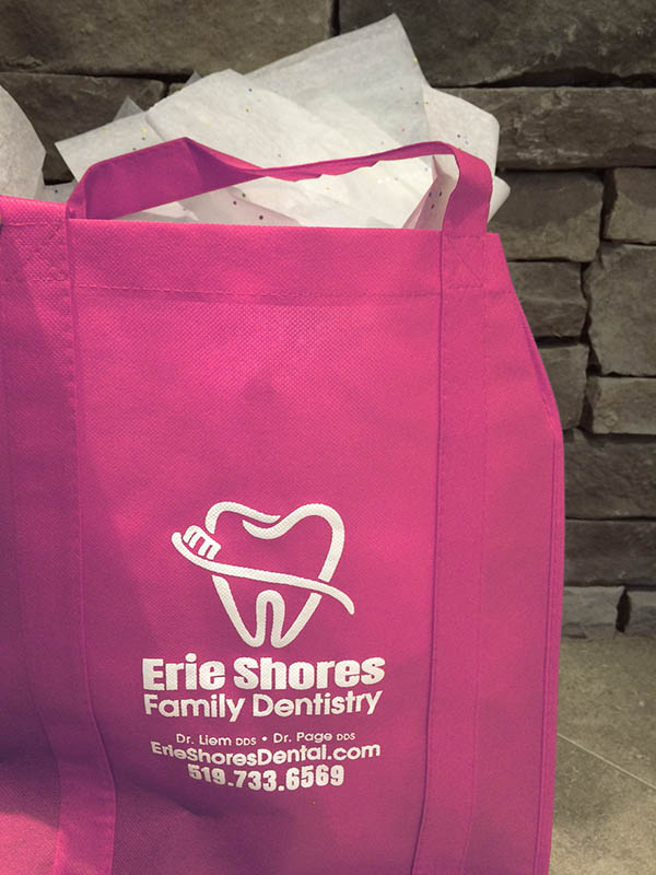
In our concept phase, we played with a wide variety of thicker edged tooth & brush illustrations and fonts, and maintained their bold colours, but assigned proper Pantones to them. The concepts were much more family friendly and easily legible. We then created a new mini Branding Guide with the selected logo on different backgrounds and reduced colour options to ensure their branding would be maintained on all marketing collateral. We were happy to be requested to redesign their business cards and create their first professional Welcome Brochure for new patients. K Design helped condense, organize and edit their company information, take photography of their office and famous fish to include in the brochure, as well as design and print the final. Thank you to SpeedPrint for the great printing! We also hunted down some complementary holders for the front desk.
Congrats on your new branding Erie Shores, and excellent service to all your clients.
We hope our new designs will give ‘fresh breath’ to your future marketing and help attract clients for years to come.
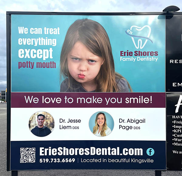
BRANDING GUIDE, PROMOTIONAL & BILLBOARD DESIGNS


Erie Shores accepts referrals and new patients.
Their website: https://www.erieshoresdental.com/
Follow them on Facebook: https://www.facebook.com/erieshoresdentaloffice/?ref=br_rs
Sorry, the comment form is closed at this time.


