Captured

Mark Caza Photography Logo
Mark came to us with a desire to update his logo to something more unique + memorable. His business captures moments to express emotions + captivate his viewers. We needed to do the same with his logo.
We liked the idea of maintaining his signature ‘m’ within the ‘C’, and creating something simple + timeless. We aimed to create something that represented his photography style + the his high-end talent + services. The icon also needed to be able to stand alone for watermarking images etc.
Here is the old logo + new logo (both horizontal + vertical variations provided). We are glad we were able to create a graphic to capture Marks attention + keen eye, and hopefully those of his future clients.
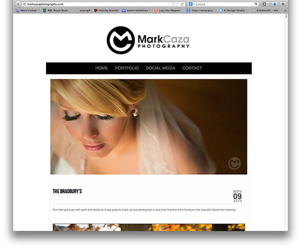
Logo in use

To check out more of Marks amazing photography check out…
http://markcazaphotography.com/
Kudos notes
Mark Caza:
No going back this is the one. I thought it was going to be 8, but i kept coming back to 13. I think this one is just a little more original which is exactly what i was looking for. Great job Kristine!
Sorry, the comment form is closed at this time.


