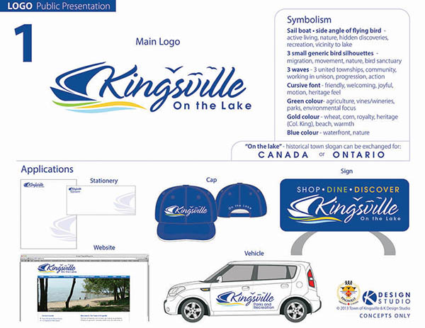
Winning Logo!
And the winner is (drum roll)….LOGO #1!
Message from Kristine:
Sincere thank you to the public, all committee members and KDHS students who took the time to vote and provide comments on the logo designs. Your voices were an integral part of the process and decision making. Extra thank you to Mayor Nelson Santos for giving me this exciting opportunity to be part of the rebranding of the Town of Kingsville. I am honoured to give back to the community that helped raise me. Have fun with your new logo Kingsville!

© 2013 Town of Kingsville and K Design Studio.
Logo cannot be duplicated or used without the permission of The Town of Kingsville.
Contact Dan DiGiovanni from Town of Kingsville for proper file format and permission of use of the new logo.
Dan DiGiovanni, Chief Administrative Officer
E-mail: ddigiovanni@kingsville.ca
Phone: 519.733.2305
Here is the front cover article from the Kingsville Report this week, written by L.G. Karry. Great summary of how it all shook down at the final council meeting.
New Brand for the Town of Kingsville
Kingsville Council chose a new town logo to more aptly express the goals and visions of the municipality as it moves forward. The branding exercise was open to public consultation after much research and development to narrow the field down to three options. The logo most often chosen by the public was the same one favoured by the majority of Council.
A total of 635 people participated in the last round of public consultation, with just over half supporting Logo 1 which presents the word Kingsville in a flowing script with a sailboat, waves, geese, and the words “Kingsville on the Lake”.
According to the notes provided about the logo, the sail boat also represents the side angle of a flying bird and symbolizes active living, nature, hidden discoveries, recreation and proximity to the lake. Three small bird silhouettes, one dotting the last “i” of Kingsville represent migration, nature and the bird sanctuary, while the three waves underscoring the sail boat are meant to signify the three united townships, community, and working in unison. The three colours chosen—green, gold, and blue each have meanings of their own. Green characterizes agriculture, vines/wineries, parks, and the environment; gold denotes wheat, corn, royalty, heritage (Colonel King) and warmth; and blue embodies the waterfront and nature.
Deputy Mayor Tamara Stomp was the one dissenting vote. She said that the logo in Option 1 was too similar to that of LaSalle and Lakeshore, and that the more fully fashioned geese in Logo 4 were more representative of the town. (Logo 4 was a redesign of Logo 3, which was the second most popular design.)
In a 5-1 vote Option 1 was chosen by Council. Some of the opinions given in the public consultations for Option 1 were that it was simple and clean but has meaning; best represents Kingsville to residents and visitors; shows a fresher and more diverse image for Kingsville; silhouetted birds pay homage to Jack Miner; flows the best with sailboat, birds and writing; movement in logo like wind blowing off the lake.
The logo designs were provided by Kristine Verbeek, Creative Director of K Design Studio. Involved in graphic design and illustration for twenty years, her list of clientele include the NHL, Marvel Warner Bros., Parks Canada and several other municipalities. She worked in conjunction with Mayor Nelson Santos and they consulted with the Kingsville Parks, Recreation, Arts and Culture Committee, the BIA, and members of the Community Based Economic Development Committee, Kingsville District High School as well as the Kingsville Management Committee.
Kudos notes
Mayor Nelson Santos
(after final Council Meeting):
It was a good feeling all around to be able to present two very fresh logos that Kingsville can be proud of…many thanks for all your spirit on this project.
Sorry, the comment form is closed at this time.


