


New Thundering Levels
Oakvile Thunder Volleyball Club – New Branding, T-shirts, Website
Big News! After over 2 decades as a volleyball club, Oakville Thunder has grown and evolved, and decided it was time for a rebrand upgrade! K Design Studio was referred to them through a previous volleyball client, and we were proud to assist the evolution of their club branding to new THUNDERING levels.
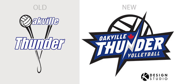
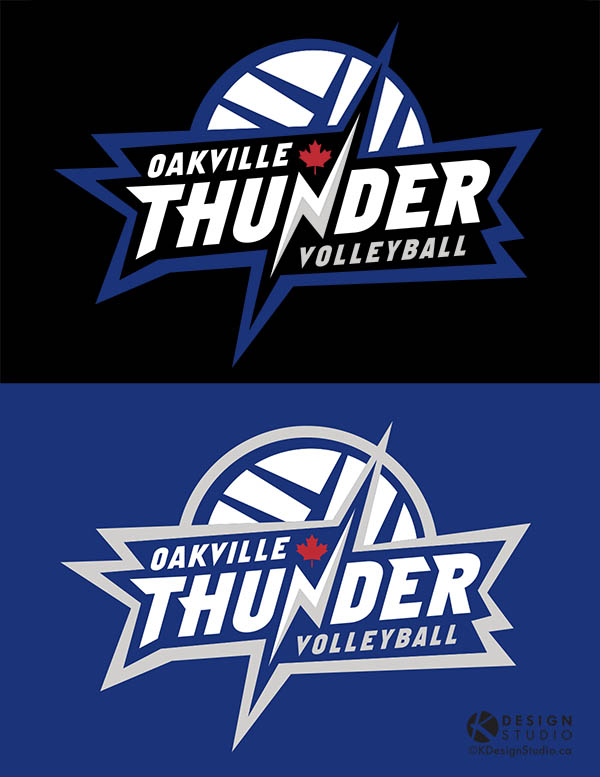
We designed the new logo to reflect who they are as a club today and to symbolize what Oakville Thunder hopes to be in the future. The new logo evokes the boom, the boldness and the strength their club delivers. The colours are an exact match to their long-standing club branding, and the new red maple leaf represents their Canadian pride, when they play in USA tournaments.
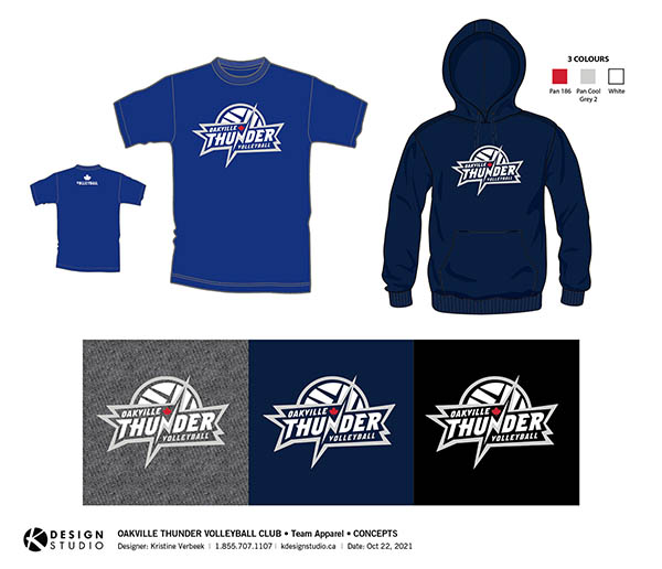
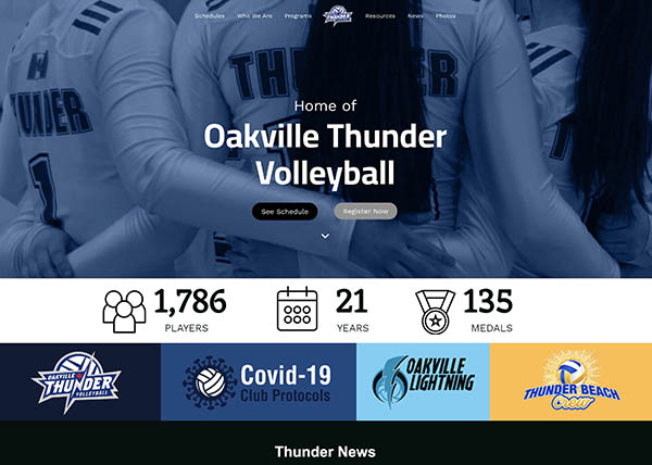
Swiftly after their logos and Branding Guide were completed, K Design helped design some new club apparel with the new branding, as well as assist to do a major refresh on their outdated (and slightly malfunctioning) website.
Excitement was received by the Thunder members and parents upon launch. We can’t wait to see their new branding on all their club gear and apparel worn by the Oakville Thunder family. Go THUNDER!
New branding teaser images are below. To view their freshly updated Oakville website (some areas still in progress) click here.
Old vs New Logo Designs
Apparel
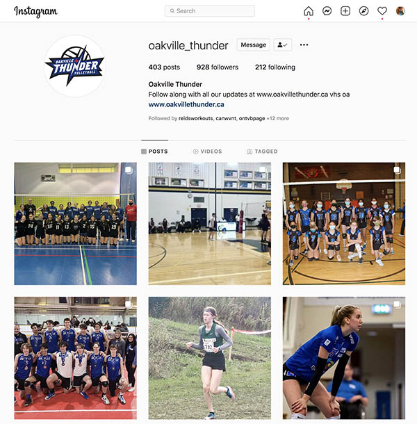
Website & Social Media updates
Client Comments
In partnership with K Design Studio, Creative Director Kristine Verbeek has been an essential part and an amazing partner to work with in rebranding the Oakville Thunder Volleyball Club. After visualizing and researching what “Thunder” means to our athletes, families, and volunteers – we have come to decision around a final logo design and are ready to finally unveil it!
Sorry, the comment form is closed at this time.


