


Branding + Strategy
RSS FEEDUp and Up

Updated logo and new corporate look completed for Up-Right Services ; a very cool Toronto based film & entertainment supply company. Visuals below… Business cards with fresh logo Signage Held up by their own pipe & clamp products! Website Action-packed website is in the ...
read more »Powerful Solutions

Mantrologix Trade Show Presenting a fresh, new powerful look for Mantralogix. Client was excited to launch their new branding at their 2012 Trade Show with new booth, brochures, pens, and draw box. We utilized interesting images, and fresh colour blocks focusing on their corporate red and black to create a ...
read more »Let the Games Begin!
2013 Ontario Volleyball Championships New 2013 Championships logo unleashed, along with updated website. Lots of new features including: – Mobile friendly, responsive design for mobile devices – updated graphics – online registration with team + logo picture uploads – gravity form-field- online ...
read more »Pak-mania
Through the last few years, K Design Studio has assisted Pakmen Volleyball to brand-boost it’s ever-growing club. This includes trendy prize + membership T-shirts, program logos, order forms, website updates + much more! Below are some favourite graphic samples, and a Pakmen Blog detailing more of the ...
read more »Financially Secure

Presenting new logos for Ridley Brackell Financial, a Windsor Manulife Securities Inc. division. This company is a joint partnership between 2 exceptional women, and Financial Managers, Cammie Ridley + Linda Brackell. They wanted matching logos for their business collateral, but each with unique colour schemes. We ...
read more »The Right Age
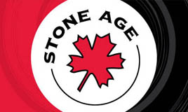
In the 4 years of servicing our client Stone Age, we have created 500+ original and licensed products. Proud to announce the new 2012 T-shirts, headwear, stationery etc are selling like wildfire across Canada! To help beef up their corporate connections, we have recently integrated them with social media + redesigned ...
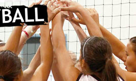
read more »Ontario Volleyball Hype
2012 has already been another busy, and exciting year designing the event logos, t-shirts, team uniforms and Ontario Championship website for Ontario Volleyball Association. Here’s the finale of event logos and garments recently completed. Can’t wait to see players proudly wearing them out on the courts + ...
read more »High Performance
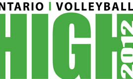
We expect nothing less than High Performance from Ontario Volleyball Association players and professionals. Our graphics aim to reflect that pursuit of greatness. We continue to research brands and youth graphic trends to keep OVA’s logos and garments fashionable and attractive to the players. We understand the ...
read more »Fanatical

Funky company stationery package completed for Financial Fanatic. Set includes stylish business cards, letterhead + envelopes. Fun Fact: We intentionally rounded the card corners of the business cards to mimick the round edge of his happy face logo and calculator products. We also ensured the letterhead + envelope ...
read more »Wrap it Up
Playful vehicle wrap for Surprize Enterprize Inc to match with their new corporate branding.
read more »Strengthening Capabilities

Showcasing all new business collateral for Supply Chain Systems. Includes: – Customized linen embossed and foiled folders – 2 sided matching linen QR coded business cards – Full colour, 3 panel folded, high-quality printed brochure A new stacked logo option was also created for client. This will give ...
read more »Logo Competition- 3rd!

K Design Studio is the proud to announce Kristine’s 3rd place finish in the Ontario Volleyball Logo competition!! There were 1050 votes cast, and 50 logo submissions. A BIG thank you to everyone who joined the hype of the competition to support the event and our client OVA. (especially those who voted for ...
read more »Good Hands

Illustrated logo and signage completed for In GoodHands – Chiropractic, Rehabilitation & Wellness Centre. Transformed their previous cartoon styled logo into a more sophisticated, clean-cut, high-end symbolic logo. The illustrated hands are in specific formation to represent circle of life, balance, ...
read more »All Natural

NEW Logo and Banner for Brampton Naturopathic Clinic now complete and ready to visually sweep you off your feet and into her healing hands. Themes captured: Nature, peace, circle of life, waves of energy, balance of mind-body-soul, connection, unique choices..and whatever else your mind may see. Logo design Banner ...
read more »Muscle Man

Watch out for this feisty looking character on athletic wear across Canada. K Design Studio helped HARDGEAR® fine-tune and transform their illustrated Muscle Man into this hot little character. Here is the most recent version- sporting a new tank top + year of establishment, to remind clients of the longevity and ...
read more »NHL : Part of the Action!
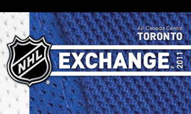
NHL Exchange Conference at ACC July 2011 was a ‘hit’! THEME: Part of the Action Attendees collateral contained visual textures of real jerseys and other hockey equipment they could wear and follow for the event. K Design Studio designed and coordinated printing for: Directional signs, Mylar street signs ...
read more »Town of Cobourg Branded
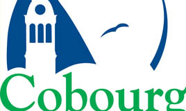
The Town of Cobourg is officially ready to rock and roll! (or bike and swim) Their first official Corporate Logo ID Branding Guide is now complete. Guide includes updated tourism logo, new departmental logos, freshly vectorized historical Coat of Arms, and colour variations and guidelines of the proper usage of all. ...
read more »The Jets have taken off!

Winnipeg Jets have unveiled their new logos for the 2011-12 Season! Let the design, manufacturing and purchasing frenzy begin!
read more »Velocity

Get got caught up in the action! Presenting the new logo for Velocity Volleyball. Jim Konrad, currently a Coach at the National Beach Training Center, is the entrepreneur and manager of this new club based out Leamington. This logo needed to be pumped visually with youth, vitality and velocity (of course). We felt the ...
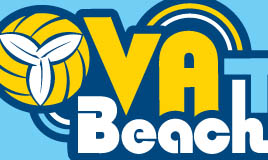
read more »High Performance
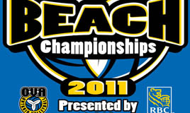
OVA Beach Championships + ADP High Performance Logos and graphics now ready for action!
read more »


