


Why just LIVE when you can THRIVE
This was a fun logo project for Thrive Live Blood Microscopy! TLBM is an amazing new company launched in Essex County, ON. Carly Erber has a BIG passion for helping people heal and find the root cause of their health issues. Under microscope, she analyses your blood right on the SPOT. It can reveal over 50 aspects of the state of your health, including the condition of your red blood cells, presence of parasites & bacteria, inflammation, hormonal imbalances, deficiencies, organ functions..and MUCH more!
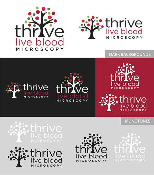
For her new logo we played with the imagery of trees- a symbol of thriving growth and life, and fun blood cell spots.
Check out her website / book an apt: Thrive Live Blood Microscopy website
Logo Examples

Client Comments
Carly Erber, Owner Thrive Live Blood Miscroscopy:
I. LOVE. MY. LOGO.
In the past, I had almost always been disappointed with the process and products of graphic designers that I had worked with, to the point that I taught myself some basic Photoshop and Illustrator skills and just started doing it myself. I should add that I am VERY particular. However, when I started my own business I realized that I didn’t have the objectivity or the brain space to create my own logo, AND I thought that my concept would be difficult to represent visually, PLUS I wanted it to be super amazing. That was a tall order, but I got all of it and more with Kristine at K Design Studio. My experience was amazing from beginning to end:
Step 1: We met up to for an initial brainstorming session. Kristine asked a lot of great questions about the details of my business (practical and emotional), which really got me thinking, and ultimately helped me with my business plan in addition to the logo design process. She showed me examples of some of her logos, and gave me pointers to find logo inspiration online, as well as some resources for other aspects of my business.
Step 2: Kristine compiled my answers with the inspirational images that I had collected, and came up with Round 1, which totalled 22 different logo ideas!
Step 3: After I had given my feedback on the logo ideas, Kristine compiled Round 2: 15 variations of the design concepts that I had gravitated toward in Round 1.
Step 4: After I had spent some time mulling over Round 2, we met up at Kristine’s office. We played with colours from her Pantone book and I got to fuss over the spacing of minute details like the dot over the “i”. Being able to come to her office super expedited the process, and it allowed us to combine Kristine’s expertise with my need for control.
Step 5: I have my logo! Shortly after our meeting Kristine sent me a vector file of at least 10 versions of my final logo (horizontal, vertical, 1 colour, 3 colour, 5 colour, light background, dark background etc.), including the font and Pantone information. Kristine sent me off with expert advice on how to manage my own printing (I wish I could outsource all design work to her), and assured me of her continued support should I need her help with anything.
Kristine employs a great balance of creativity and professionalism. I am very impressed with her process and my final logo design. Every time I look at my beautiful logo, I get happy!
Sorry, the comment form is closed at this time.


