


SMASH it up!
Branding for Hamilton Smash Volleyball Club
What’s purple, blue and white and goes SMASH in the night?? It’s the Hamilton SMASHletes & new branding..of course!
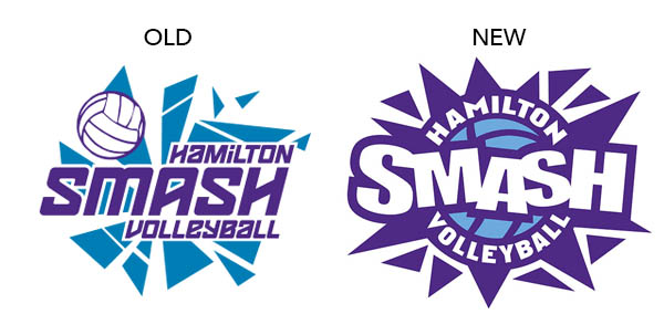
Presenting the new BOLD and POWerful logo for Hamilton Smash.
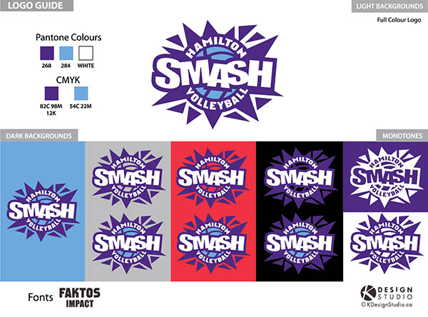
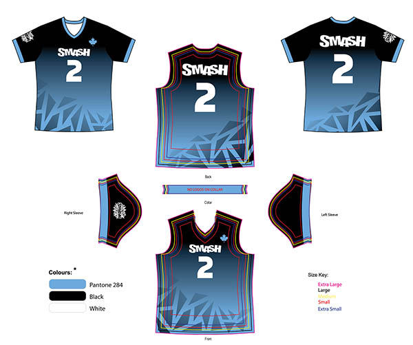
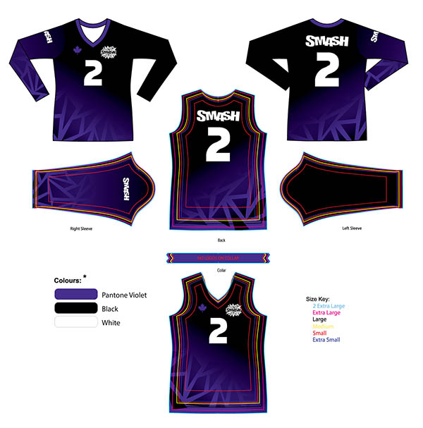
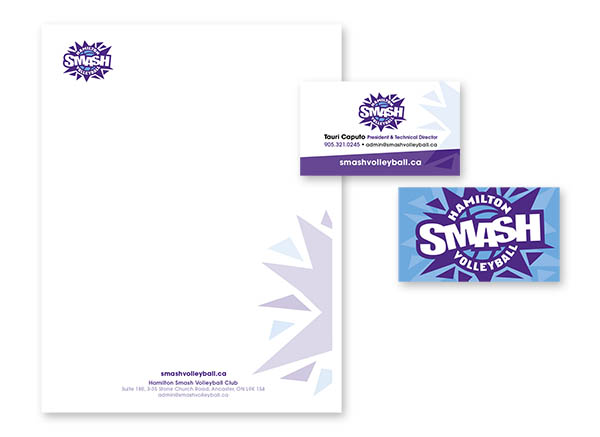
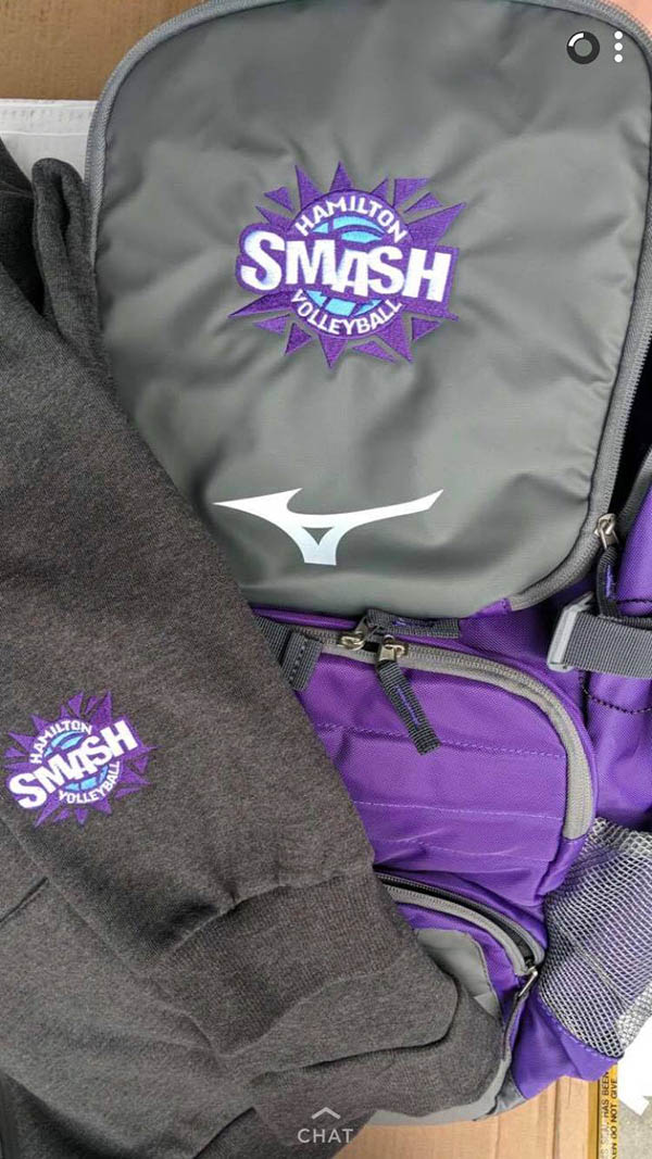
K Design worked through MANY concepts and varieties of styles with President Tauri Caputo. Our K Design mission was to keep a bit of essence from the original logo, but create something fresh with a visual POW from a distance. It also needed to be youth appropriate and fun for the players to wear, and also MUCH easier to embroider and print across a wide range of Smash swag and team gear. Below are the final logos styles, including 3 & 2 colour variations and solutions on a variety of backgrounds and monotone styles for engravings, new swag, stationery, water bottles, uniforms and decals.
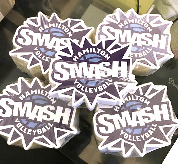
It’s been fun seeing the new branding SMASH its way into the volleyball realm. We can’t wait to see these decals below on windows around Ontario. For more info on their club & programs, and to purchase SMASH swag check out Smash Volleyball Website
MORE SPORTS DESIGNS CLICK HERE!
Old + New Main Club logo design
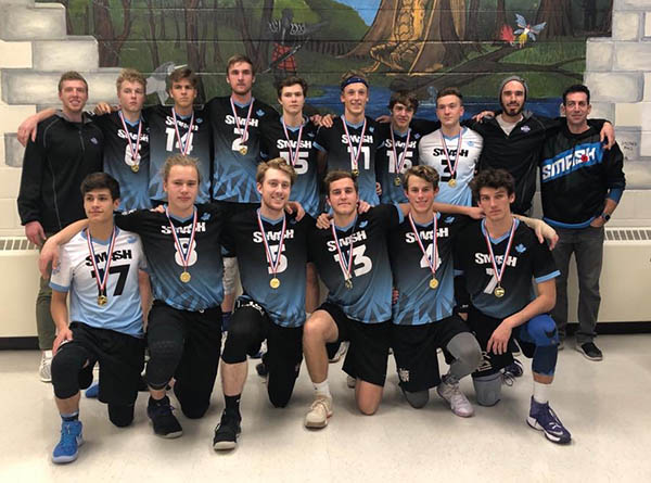
Branding Guide, Initial Swag, Jerseys and Stationery

Kudos notes
Tauri Caputo, President/Technical Director, Hamilton Smash Volleyball Club:
Pretty happy with the final result!
Thanks for all the hard work.
Sorry, the comment form is closed at this time.


