


Live Green
Live Green Energy Solutions Corp Identity
LGES owner, Tom Miller, approached us with the desire to rebrand his quickly growing company. The initial stock art logo, business cards + website he started out the company with were no longer ‘up to snuff’ with the image he wanted to currently present to his clients. He was ready to take things UP to a new graphic level. Here’s our graphic solutions, to better represent his products + services…
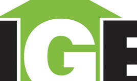
Logo design

– Bright eye-catching green to represent environment, money (cost savings)
– UP arrow also symbolizes a house icon, and the flow of energy and rising of heat + savings
– Bold lettering to give visual impression of professionalism + strength
– Easily legible at small + large sizes, engravings on products etc.
Logo Style Sheet
We provided colour variation for different backgrounds and products.

Old + New business card design
Utilizing both front and back to make a stronger impression and more space to list out services.
Keeping all changeable info (employee names/contacts) on same side so cost efficient for printing.

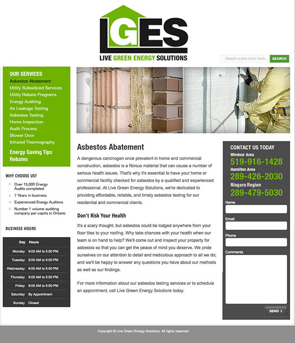
Updated Website
Client desired just simple HTML update at this time. Our simple solution.
Contact Tom Miller at tom@lges.ca to see how your company (or clients) can turn energy conservation into great savings, as well as help save the environment.
Sorry, the comment form is closed at this time.


